


Client: Australian Spine Registry
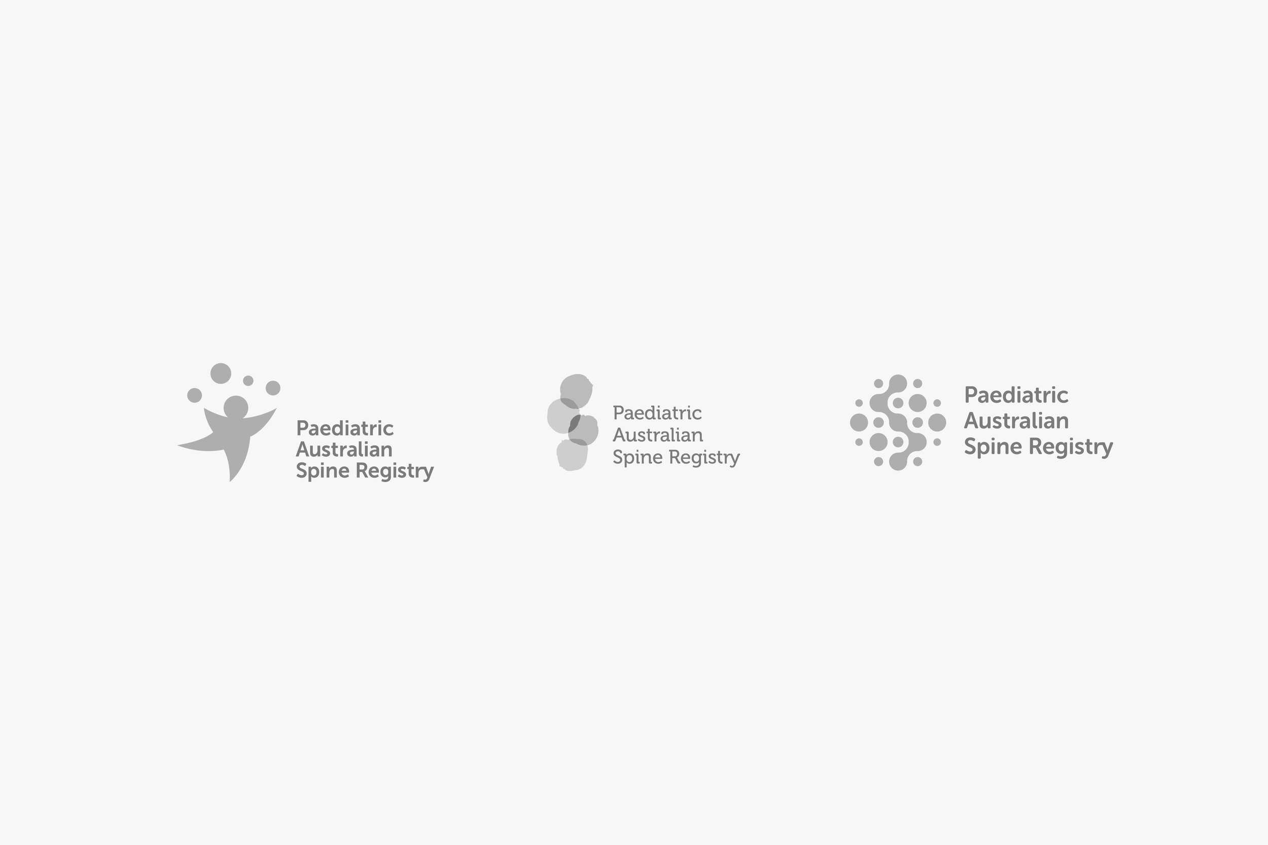
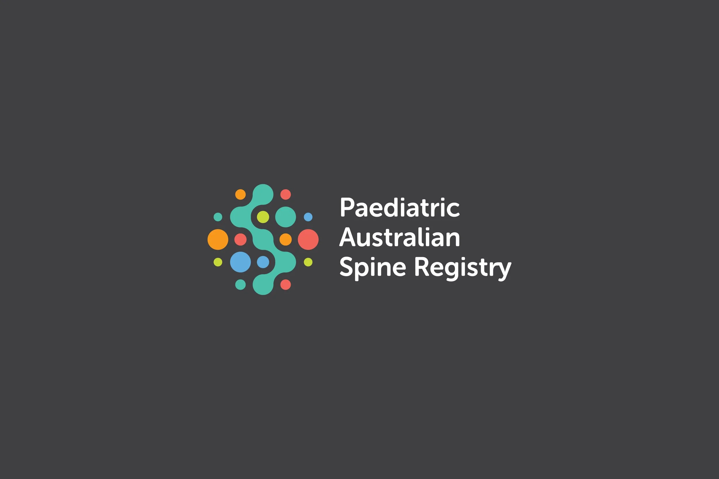
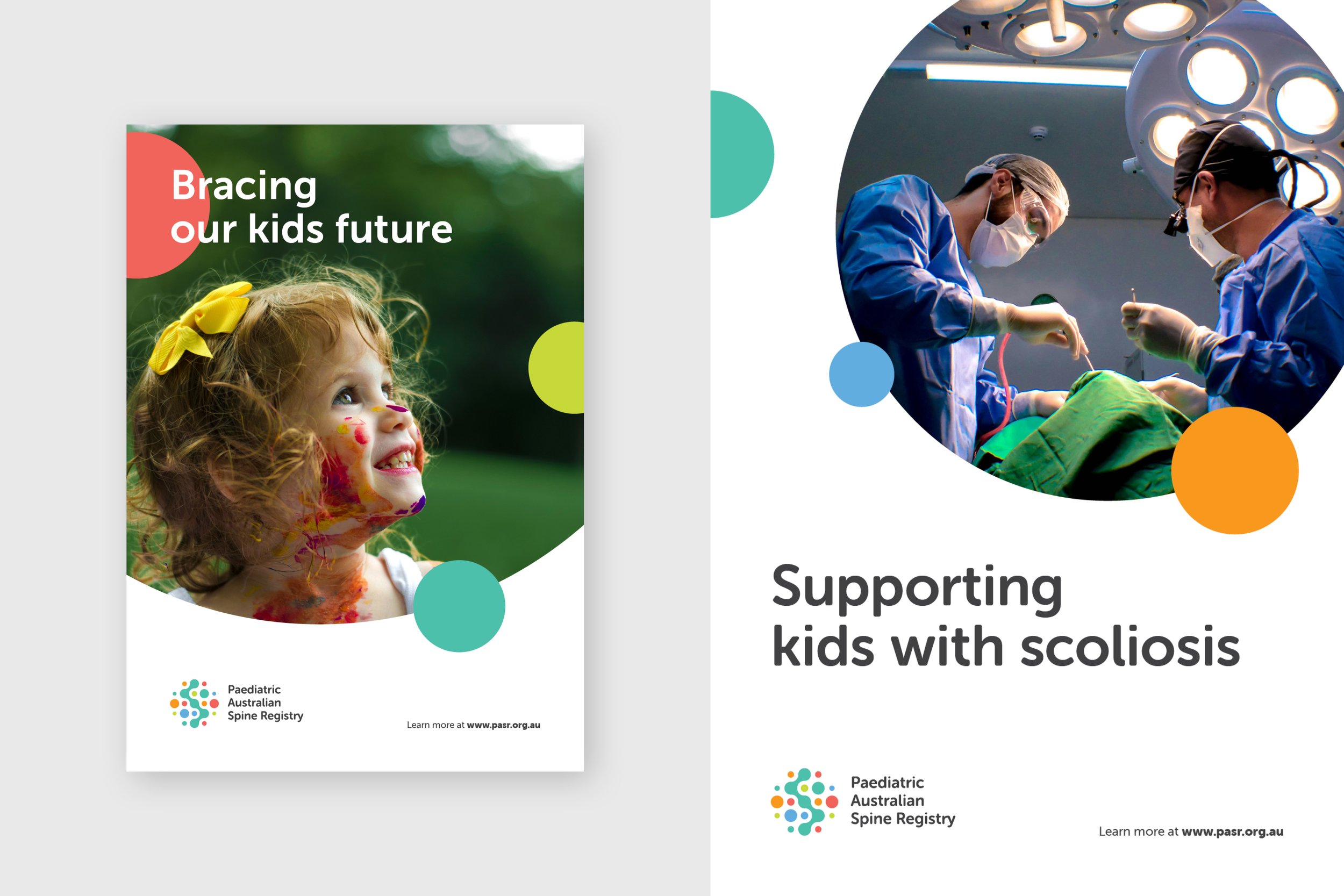
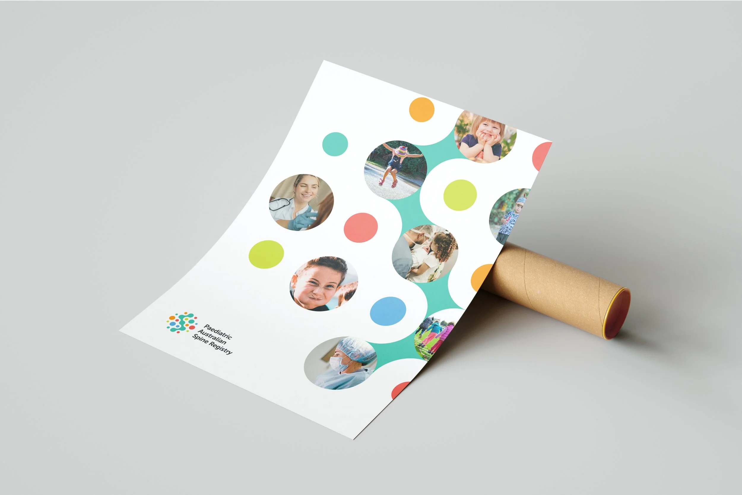
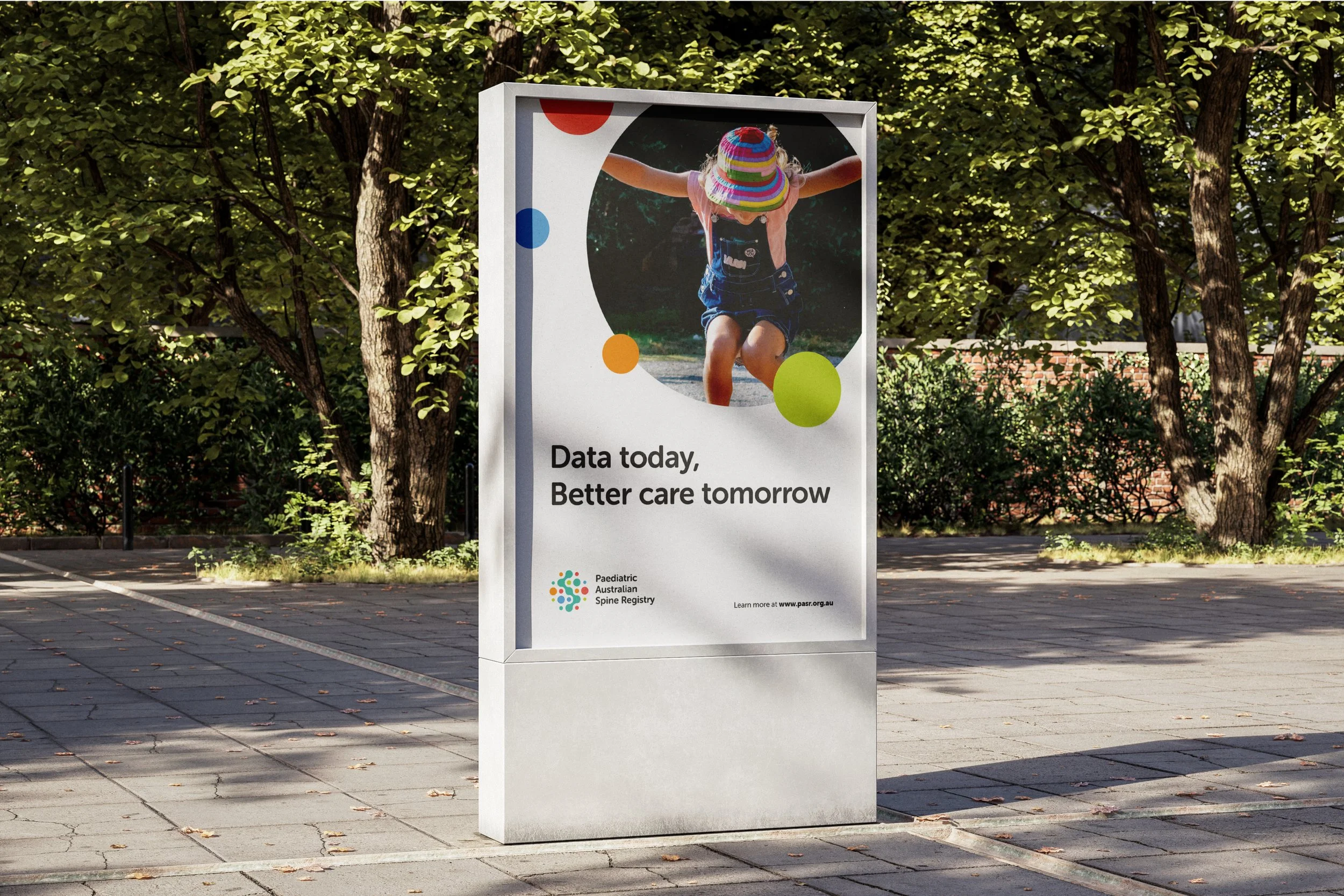
The ASR approached me to create for them a sub-brand identity for their paediatric division. Being a part within the ASR there had to be a clear visual connection to the existing ASR branding, but the client wanted this paediatric version to feel more bright and ‘child-friendly’.
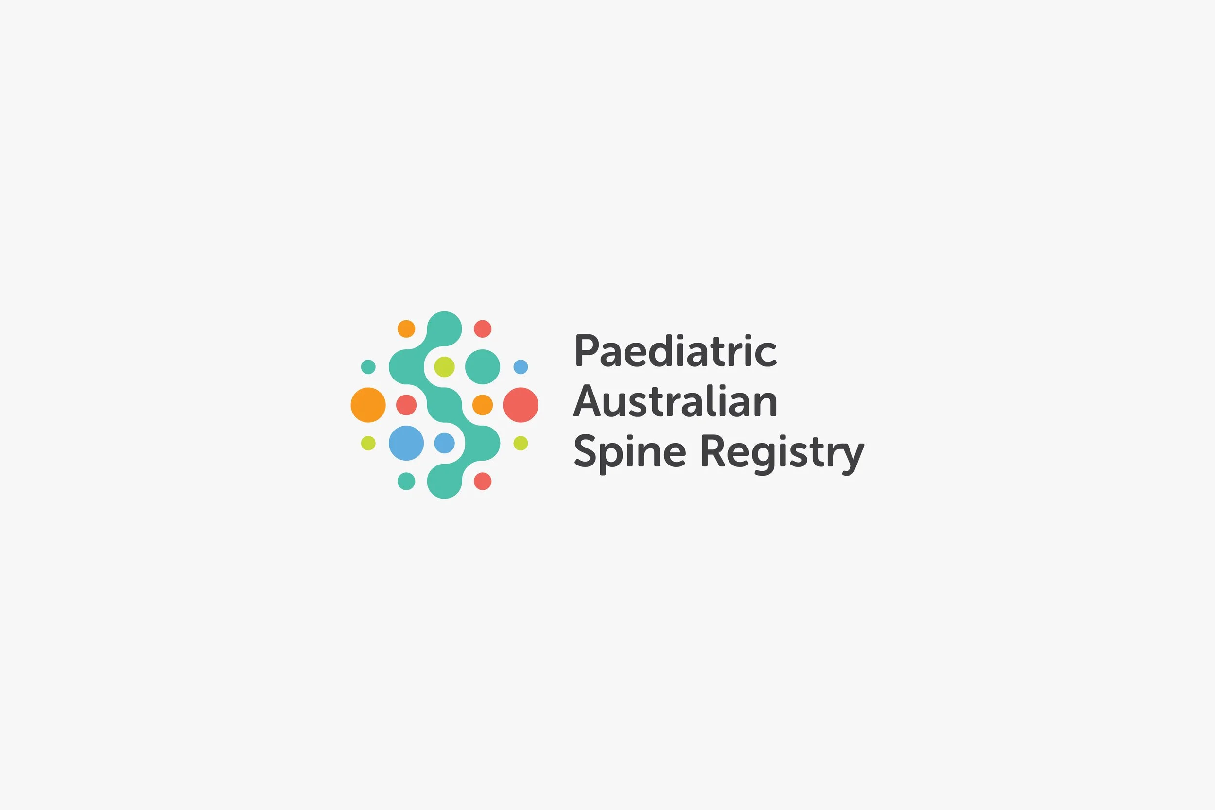
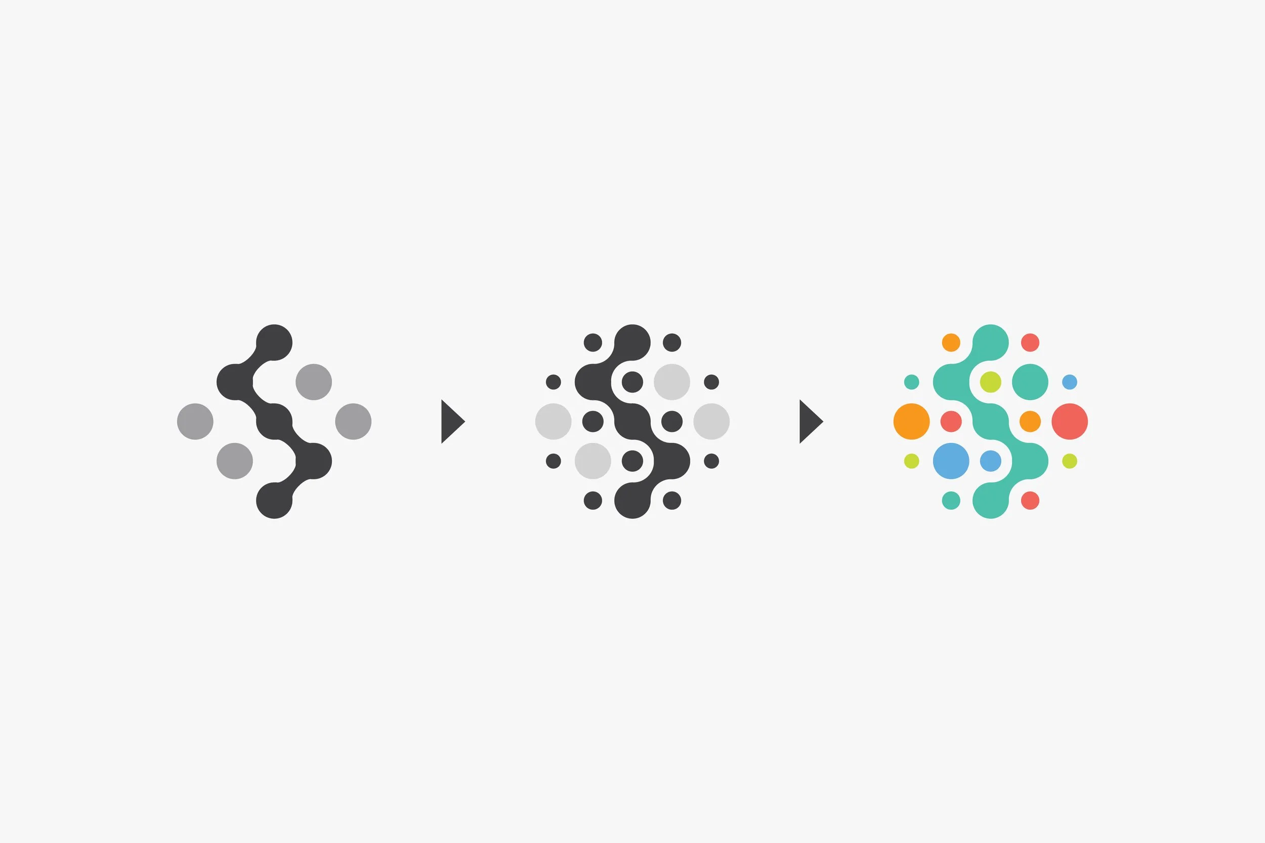
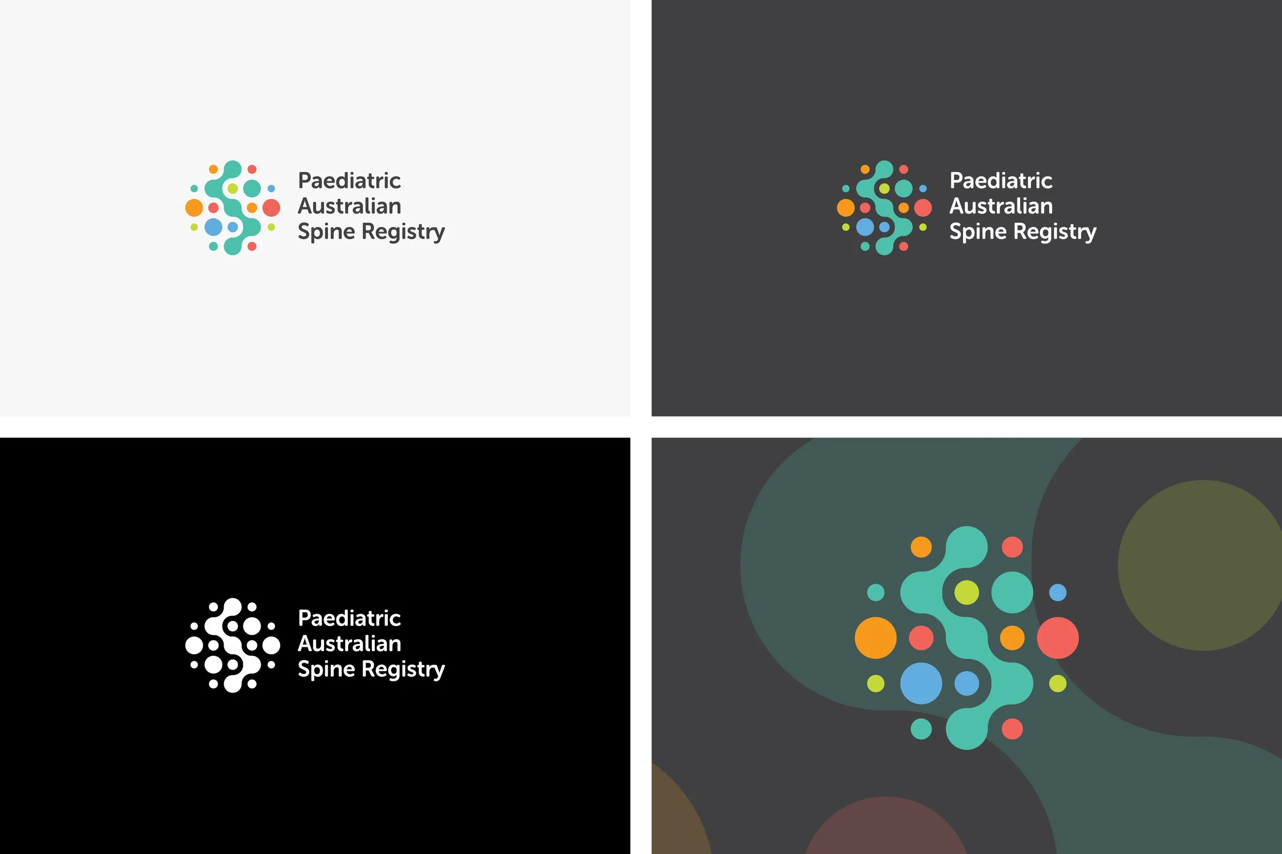
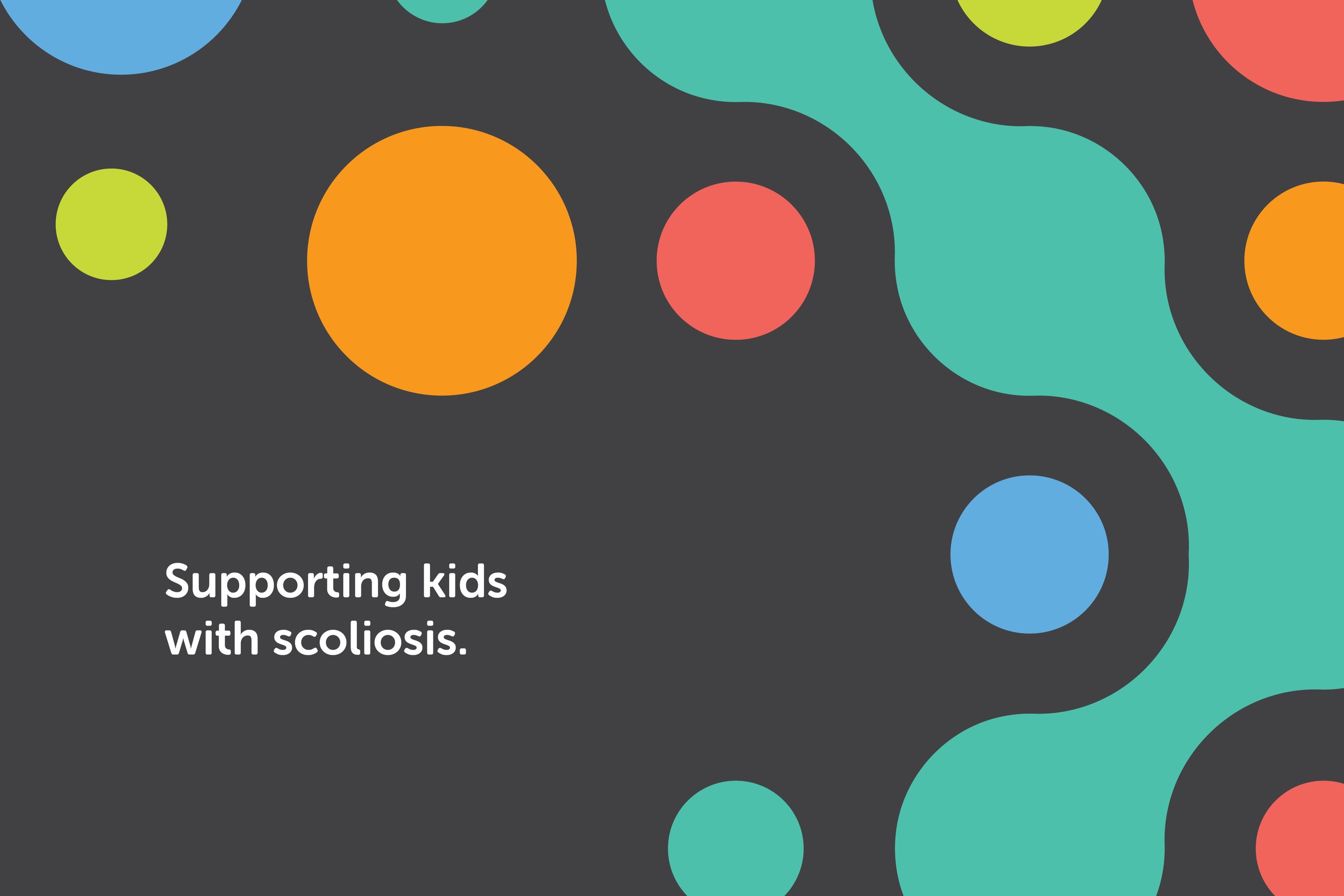
The final logo icon took the shape of the original ASR icon as an inspiration, but adapted it to create something new. With its vivid multi-colour palette the PASR logo was modern, fun and playful.
This PASR logo struck the perfect balance between something new and exciting, while still maintaining a solid link to its ‘parent’ logo.