Client: Wyvern Private Hospital
I was approached by the CEO of Wyvern after having seen some of my branding work for another medical registry. At the time he had begun the development of a brand new private hospital in Sydney and wanted me to create a brand identity that could be used on all touchpoints of the hospital. This was the result.
The icon takes inspiration from the ‘wings’ of a literal wyvern, while the shape also graphically hints at the shape of a “W” reinforcing the brand name.
Further, the brand also has a strong connection to ‘nature’ – it’s hospital grounds are built in a beautiful garden-like area, surrounded by Australian natural fauna. Therefore the colour palette was also carefully chosen to reflect nature, tranquility and healing.
The brand identity was rolled-out into various forms of collateral including building signage, uniforms, the website, as well as all print and digital collateral.
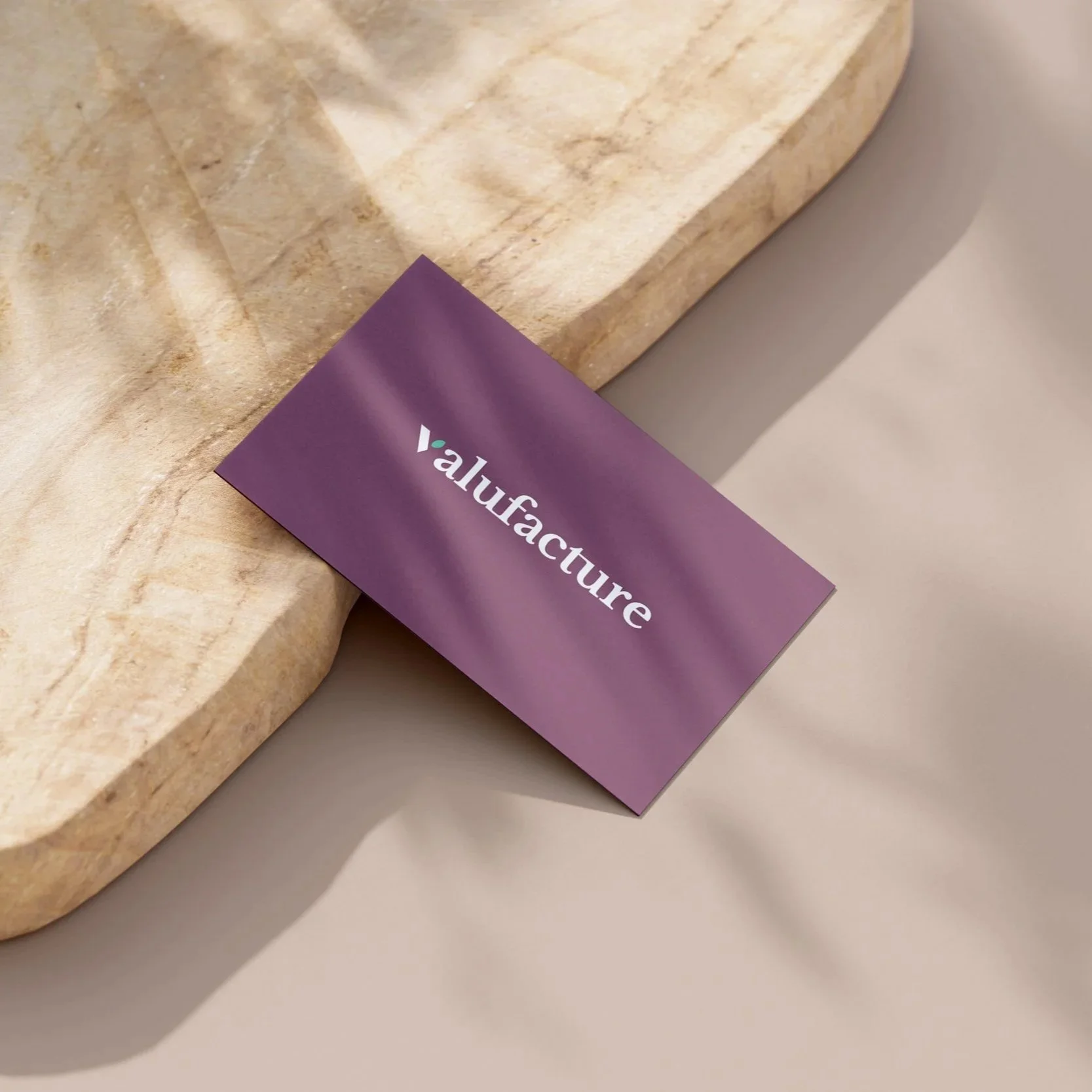
Client: Valufacture Solutions
Brief: I was approached by a client to create a new branding system for his new development company. Valufacture Solutions focuses on construction projects in the healthcare sector. The client wants to strike a balance between something corporate and professional, while at the same time having a feeling of warmth and altruism.
Solution: I was inspired by the motif of a ‘plant’ – a symbol of growth, development and new-beginnings. Furthermore the connection to nature innately creates a feeling of peace and tranquility - important qualities in the healthcare sector.
I wanted to avoid anything overly cold and clinical looking. The clean lines of the brandmark is complemented by a warm colour palette and serif typeface – contributing to an overall feeling of warmth and balance.
The brand was outputted as stationary, digital comms, and a styleguide.
Client: Australian Spine Registry
The ASR approached me to create for them a sub-brand identity for their paediatric division. Being a part within the ASR there had to be a clear visual connection to the existing ASR branding, but the client wanted this paediatric version to feel more bright and ‘child-friendly’.
The final logo icon took the shape of the original ASR icon as an inspiration, but adapted it to create something new. With its vivid multi-colour palette the PASR logo was modern, fun and playful.
This PASR logo struck the perfect balance between something new and exciting, while still maintaining a solid link to its ‘parent’ logo.
Client: Talktomii (Social App)
The client briefed me to create an exciting and eye-catching identity for their new App. The goal was to create a logo that worked with the name but also as a stand alone icon and app-badge. Several different designs and icons were explored during the creative process.
By combining a minimal typographic icon with a vivid colour gradient backdrop – this logo is an explosion of colour! The memorable colour-gradient makes the logo really pop and stand out. The circular shape of the gradient also creates a nice pattern and compliments the round shape of the logo icon.
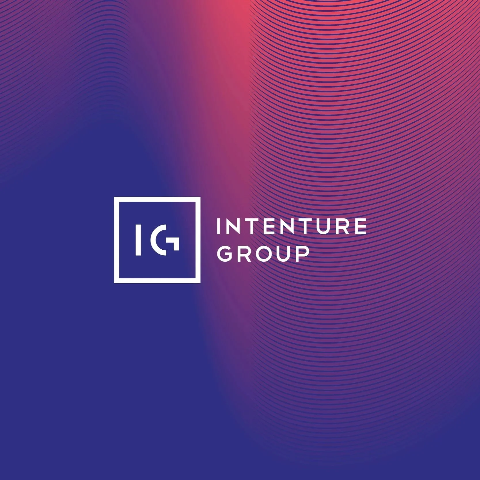
Client: Intenture Group - Recruiting
The brief was to create a new brand identity for the Intenture Group, a recruiting company based in Germany. The goal was to create a design that was both eye-catching but also simple and modern.
The Intenture branding included a full scope of materials including a new website, print collateral, digital and social media.
The final result was this modern and elegant identity system.
Client: Australia Post
The 'Guide to Fishing' is a showcase publication for Australia Post marketing. Inspired by ‘old-world’ novels and textbooks, the guide was designed to look like an authentic manual, it was filled with quirky illustrations and cheeky facts all aimed to demonstrate Post’s extensive marketing knowledge.
Credits:
Caleb de Gabriel - Art Director/ Designer
Charles Baylis - Copywriter
With illustrations from Jacky Winter
Client: Smileneo Dental Aligners
Smileneo was a rebrand project for a teeth-aligner brand based in Qatar. This comprehensive rebrand included all branded print collateral, social and web assets.
Inspired by the ‘sparkle’ of a shiny new smile, the logo ‘sparkle’ became the central graphic for Smileneo.
My goal was to create a brand that had the balance between professional and modern. The colour palette and bold use of shape created a playful set of icons and graphics that became an iconic look across all Smileneo materials.
Client: Rishi Immigration
The brief was to create a brand identity for Rishi Immigration - a company based in Canada that provides legal services to persons immigrating from India.
The logo emblem was inspired by the metaphor of a ‘seed’ – planting and taking root - just as people must lay down ‘new roots’ when moving to a new country.
The warm, earthy colours and the clean, simple forms blended together to create a brand identity that was modern, professional and striking.
Client: Oakley
A virtual 3D surf experience served in the sunglasses package.
The Pro Vision sun-glasses case transforms into a virtual reality visor. Filmed with Oakley sponsored athletes using 3D headgear; Pro Vision allowed the viewer to see, in 360-degrees, the perspective of an Oakley athlete riding the waves.
The branding concept for Pro Vision was ‘transformed vision’. The logo hints at the 3D experience by the combination red/blue lenses with the existing Oakley logo.
Credits:
Nick Sellers - Art Director
Joe Sibley - Art Director
Charles Baylis - Copywriter
Tom Marley - Video & Photography
Caleb de Gabriel - Designer
Client: Advias Financial Specialists
Advias is a real estate financial service based in London. The brief was to design a new brand that was simple, professional and modern.
The typographic “A” doubled-down as a visual ‘arrowhead’, creating a feel of forward movement and progress. The choice of colour was important - the use of a deep green and vivid orange was selected to create a sense of opulence, class and gravity. Juxtaposed with simple typography and graphics, the end result for the branding was clean, elegant and modern.
Client: Monash University
The central idea behind the campaign was "question the answers". A bold and provocative message that inspired viewers to challenge the norm, explore the unknown and discover the new.
Inspired by this theme of discovery, the key visuals showed 'new frontiers in education' draped over a black backdrop – representing the undiscovered.
This new look for Monash University ran across all channels, including TV, print, outdoor, and online communications.
Credits:
Jake Barrow - Creative Director
Charles Baylis - Copywriter
Katie Britton - Copywriter
Caleb de Gabriel - Designer
Client: Multicap Tasmania
Multicap is a service provider for people living with disabilities; helping them to reach their full potential and a higher quality of life. I was tasked to create a new brand identity for the company. My goal was to create something that felt bright, empowering and uplifting.
While several design approaches were explored the final logo concept was based around this motif of a ‘bird in flight’. That symbol invokes the idea of freedom, excitement and ‘reaching new heights’. Combined with a bright and striking colour gradient, the end result was a very modern, engaging and memorable brand identity.
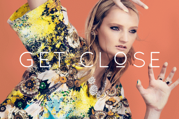
Client: Virgin Australia Melbourne Fashion Festival
The fashion festival's central campaign idea was 'Get Close'. The campaign featured a series of close-ups, tight crops and unique poses of models juxtaposed against vivid colour backdrops.
Shot by one of Australia’s leading photographers, Georges Antoni, these designs spanned a full campaign including TV, outdoor, print, editorial and various other pieces.
Credits:
Creative Director - Ben Coulson
Art Director - Isabella Caruso
Copy Writer - Ellen Fromm
Photography - George Antoni
Caleb de Gabriel - Designer
Client: Deliveroo
I created this graphic poster set to promote Deliveroo “Home-less Delivery”: a new app mechanic allowing users to make small charitable donations whilst simultaneously placing their food orders.
Inspired by swiss modernism, these illustrative posters was designed with an emphasis on bold colours and interesting composition. This colourful and playful approach elevated the “gritty” subject-matter and gave the posters a fresh, positive tone. The bold and bright colours harmonised neatly with the overall Deliveroo branding.
The graphic illustrations were also used for print, outdoor and social media platforms.
Credits:
Creative Director - Phil van Bruchem
Creative/Copy-writer - Tom Opie
Creative/Copy-writer - Chris Plumber
Designer - Caleb de Gabriel
(Photo credit: Behance student show swiss poster set)
Client: BWM Dentsu Melbourne
A minimalistic and contemporary editorial designed for BWM to promote their agency lifestyle. The editorial was crafted to work both as a physical booklet and digital publication.
The BWM agency is located in an urban artistic and cultural hub. The editorial piece showed off the urban lifestyle enjoyed by BWM employees; complete with restaurant reviews, local coffee tips and an overview of ‘Melbourne culture’. The digital version included interactive links to online restaurant reviews and way-finding links on Google Maps.
Credits:
John Scarrow - Copywriter
Caleb de Gabriel - Designer
Client: Schweppes
These typographic and 3D designs where created as a suite for the Schweppes Fan-Made Flavours competition. Fans could vote online for a new soft drink flavour that would be added to the permanent range of soft drink flavours.
The 3D typography design was inspired by the label designs for the existing Schweppes drink range. These typographic pieces became the identity across the competition and was used for the drink labels themselves. The 3D treatment was produced in entirely Photoshop, without any additional 3D programs.
The Australian Spine Registry (ASR) is a program run nation wide to assist surgeons and medical professionals. The ASR wanted to create a contemporary brand that would communicate professionalism and security.
The brand-mark was composed of small circles, reflecting collation and assembly of data, that formed together to create the "S-curve" of a spine. The graphic 'linkages' in the logo created a sense of connectivity and shared information. The brand work was expanded to include various printed and digital communications.
Client: The Lost Dogs Home
Typography and interface design for the 'Wait With A Mate' digital display.
Set up in one of Melbourne's busiest train stations, the display allowed commuters to play fetch and interact with a virtual dog.
Credits:
Jake Burrow - Creative Director
Joey Newton - Art Director
Michael Barticel - Copywriter
Caleb de Gabriel - Designer
Client: AT&M Marketing
I was approached by AT&M to rebrand and unify the company collateral. The logo branding included business stationary, some digital touch-points and brand style guide.
AT&M Marketing combines a wide variety of different creative and marketing services. The “+” symbol became the central device and focal point of the logo - inspired by the idea of ‘bringing things together’. It also communicates that sense of collaboration and progress.
A personal typographic and illustrative project :)
Client: Australian Spine Registry
This is the design of the annual report for the ASR 2019. Taking the inspiration from the brand colours and circular logo graphic, I created a bespoke design featuring this modern blue-green gradient. The overall design approach was modern, clean and simple.
Client: Schweppes
These fun and non-conventional illustrated posters promoted a new Asian-inspired drinks range that ran during The Night Noodle Market – an annual 'foodie' event run in Melbourne.
Inspired by the classic Japanese pop posters - these quirky illustrations underscored the great combination of food and drink.
Credits:
Isabella Caruso - Art Director
Ellen Fromm - Copy Writer
Caleb de Gabriel - Designer & Illustrator
A personal piece entitled "Swanston Street from the river". I was inspired to create an illustration capturing Melbourne city. This composition of the city captures some of the most famous buildings and iconography including the Arts Spire and Flinders Street Station.
It's also raining... typical Melbourne.
Client: Australia Post
A collaborative project to promote Australia Post’s domestic parcel service. The idea was to show how easy it was to send parcels around Australia. So we designed these two characters, turned them into cardboard figures and photographed them on "holiday" in various locations all around Australia.
Credits:
Marcus Byrne - Photography & Retouching
Ant Larcomb & Shane Dawson - Art Director
Charles Baylis & James Wills - Copywriter
Caleb de Gabriel - Illustrations, Animation & Character Design
Client: AFL
As part of a campaign to advertise the 2013 AFL Grand Final and raise money for charity; filings from the AFL premiership cup were collected and smelted down into a one-of-a-kind collector’s item. This metal ingot would be sold to the highest bidder to raise money for the AFL’s official charity – Ladder.
This website was designed to advertise the campaign and push viewers to bidding. The website had a simple and functional one-page structure.
Credits:
Paul Meates - Art Director
Katie Britton - Copywriter
Caleb de Gabriel - Designer
This editorial design was a showcase piece for GPY&R strategy. The agency wanted to produce a book demonstrating their knowledge of various advertising markets...in this instance mums! (mothers).
The publication was designed with beautiful colours, illustrations and infographics to showcase the information in a playful and eye-catching way.
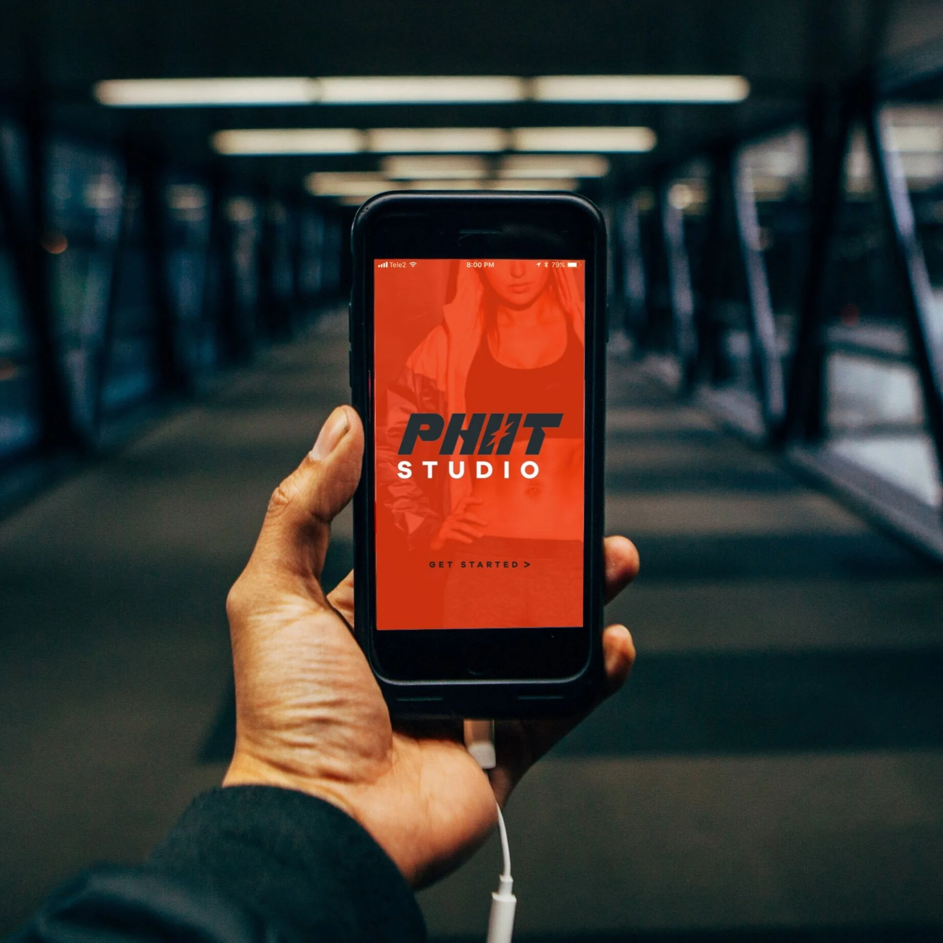
Client: Heavy Haulers Fitness
I was approached to develope the branding for a new fitness studio and workout system: ‘PHIIT’. The client wanted something modern and sophisticated, while at the same time capturing a feeling of energy, power and vibrance.
I created a custom typographic logo. The sharp angles create a more dynamic feeling. The ‘lightning bolt’ icon, cut out from the negative space, draws the eye to name and spelling - subtly reinforcing the brand name.
The branding was used across all comms; including signage, merchandise, website, and digital media.
Client: Schweppes
These advertising posters were created to promote the new 'Lost in London' series of Schweppes soft drinks.
Credits:
Jake Barrow - Creative Director
Tome Marley - Video & Animations
Caleb de Gabriel - Designer
With Illustrations from Eirian Chapman
Client: Schweppes
Campaign concept for a range posters advertising Schweppes mineral waters. The idea was to reinforce the concept of ‘subtle flavours’ by crafting beautiful looking typographic posters with very tactless messages.
Client: Schweppes
The brief was to create a decorative typeface for the existing Schweppes 'Traditionals' soft drink range. The 'New Traditionals' font was crafted to be playful and fun, while at the same time bold and legible enough to stand out on packaging and design materials.
The typeface design was inspired by contemporary scriptive typefaces. A variety of alternate characters, flourishes and ligatures were developed to allow flexibility when designing typographic lockups.
Client: L'oreal Fashion Festival
Editorial design for the Fashion Festival Event brochure. Simple and clean with an emphasis on the beautiful photography.
The overlapping framing of photography created interesting collages of fashion, textures, styling and events.
Client: Public Transport Victoria (PTV)
As a sponsor for Guide Dogs Australia, PTV were given the opportunity to name their own Labrador puppy. An internal competition was run to choose the name of the newly born pup.
I had the opportunity to create a bright, playful design for the brand-mark and poster that was used to promote the internal competition. These designs were displayed around PTV offices across Victoria.
Client: AGL Energy
AGL provides energy for every part of everyday. This energy keeps us safe, cool and organised. To remind people that energy has a human side, we created these interactive metrolites that helped to make a commuters wait more enjoyable.
Credits:
Jake Barrow - Creative director
Isabella Caruso - Art Director
Ellen Fromm - Copy Writer
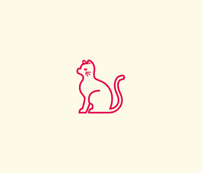
Client: Lost Dogs Home
This poster design was created to help spread desexing awareness for cats. The concept was based around the surprising and sobering statistic that 1 cat can become 20,000 in just 2 years if left un-desexed.
The idea was to create a family tree - a playful metaphor - highlighting this statistic. The illustration details and the names for each cat were unique.
Credits:
Jake Barrow - Art Director
Katie Britton - Copywriter