


Client: Wyvern Private Hospital
I was approached by the CEO of Wyvern after having seen some of my branding work for another medical registry. At the time he had begun the development of a brand new private hospital in Sydney and wanted me to create a brand identity that could be used on all touchpoints of the hospital. This was the result.
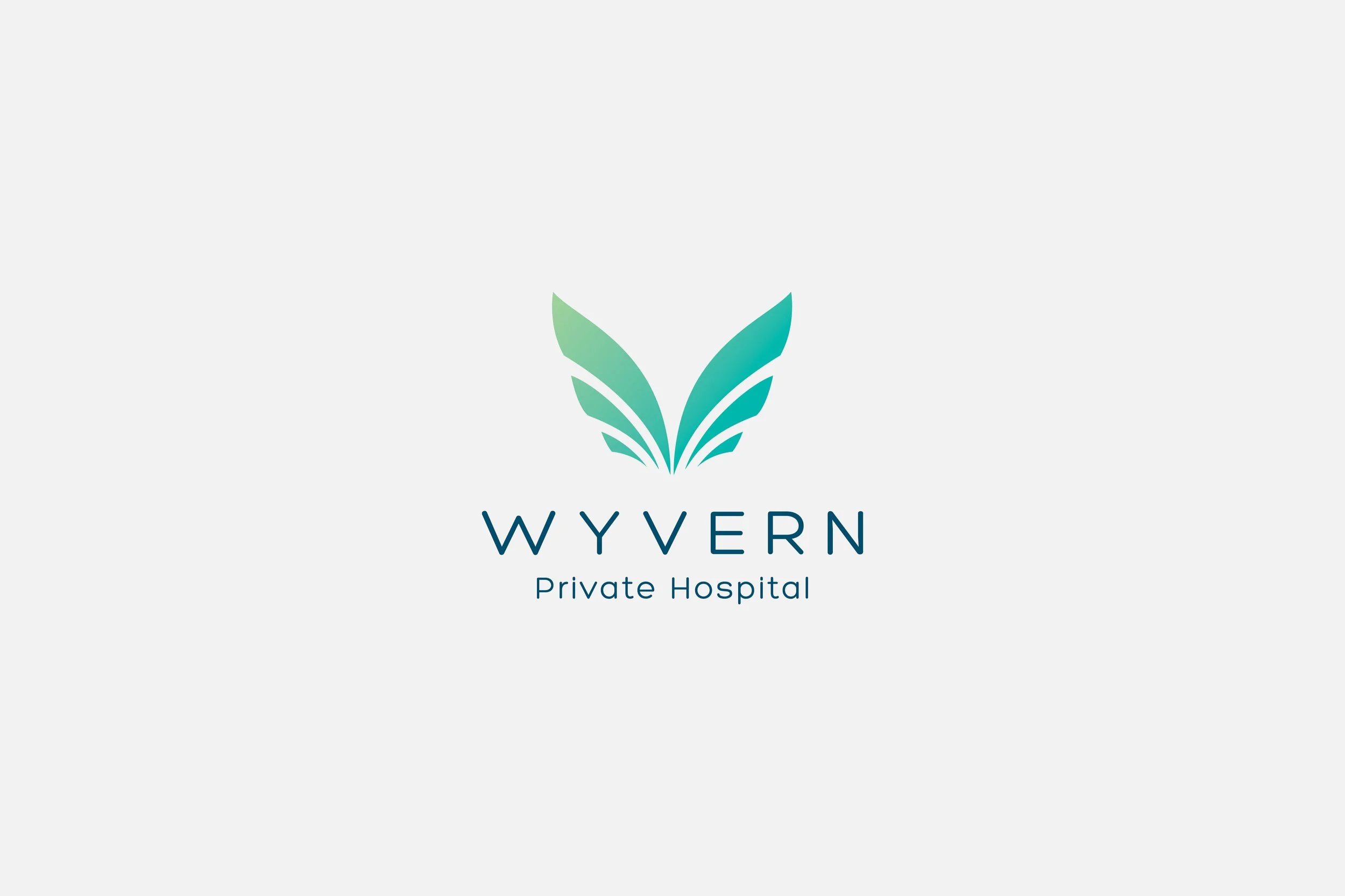
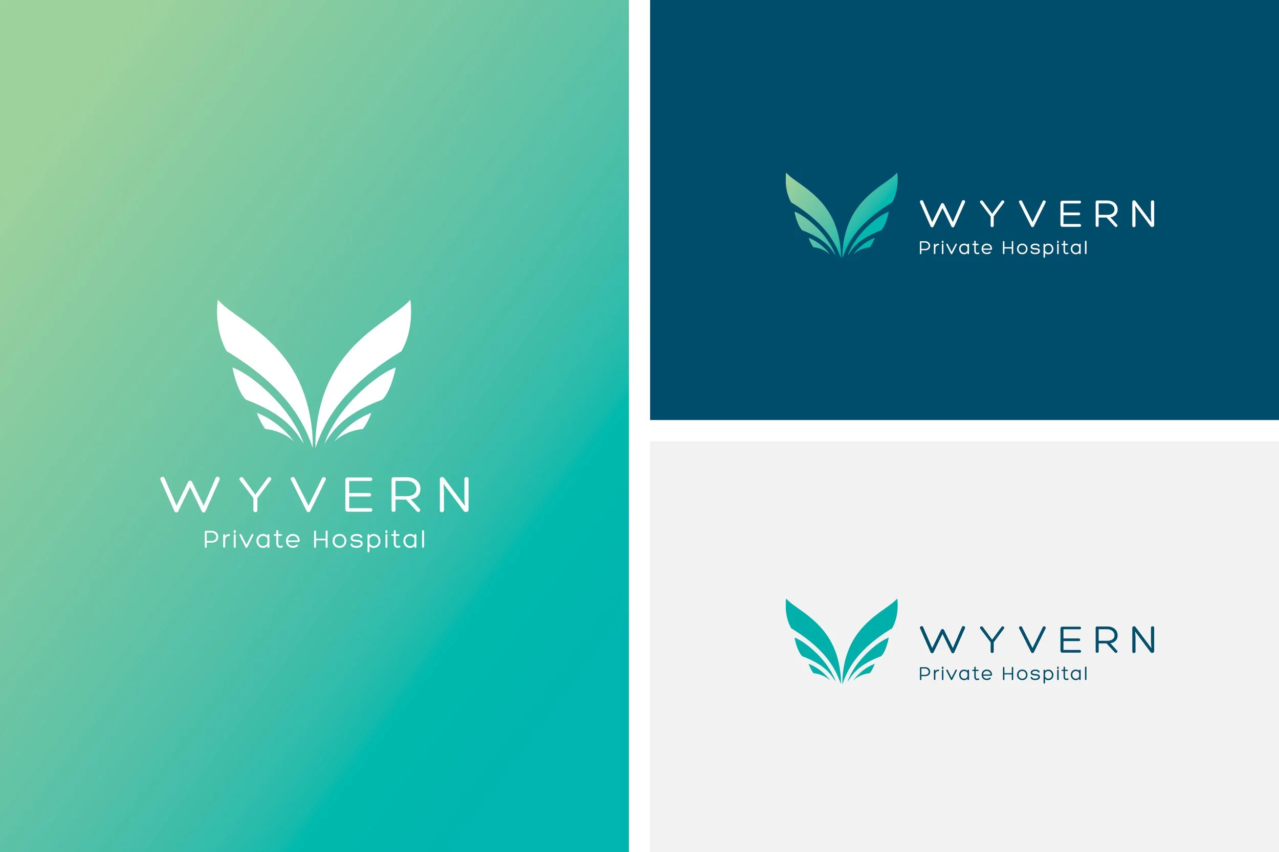
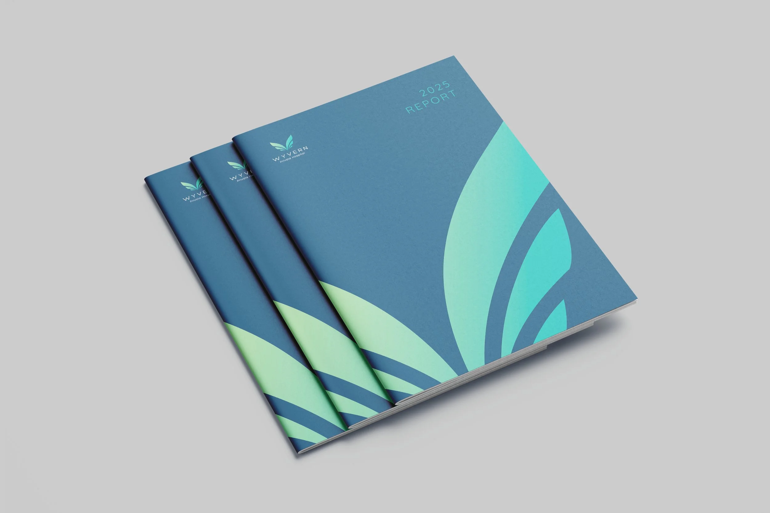
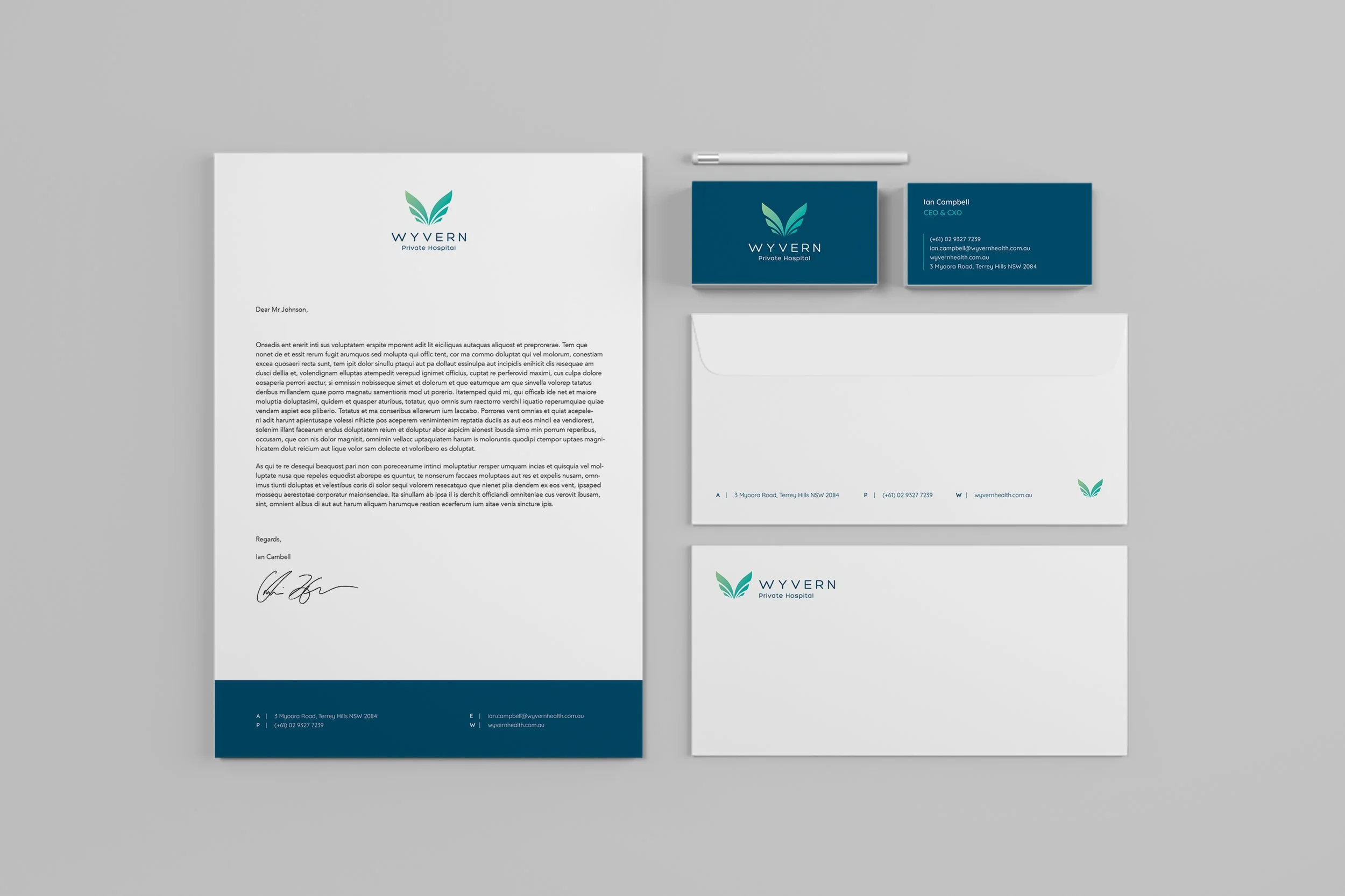
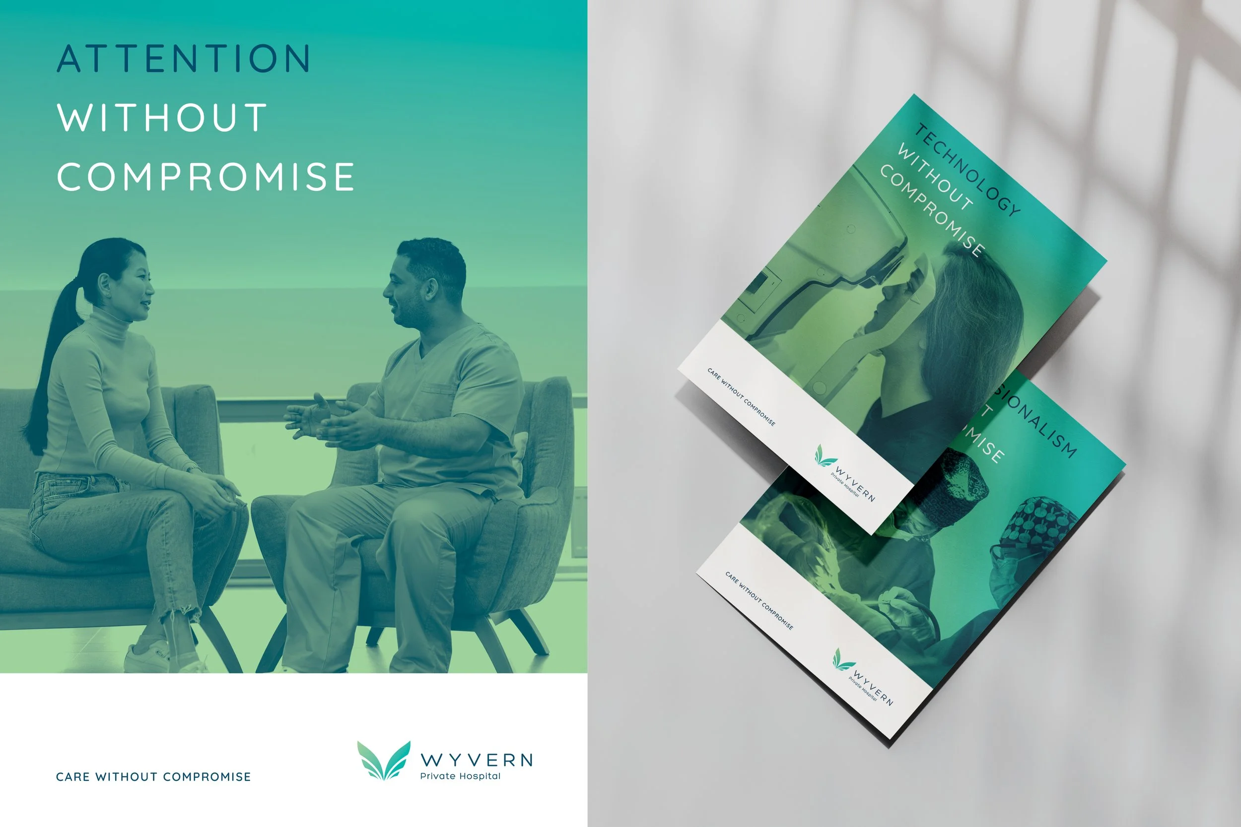
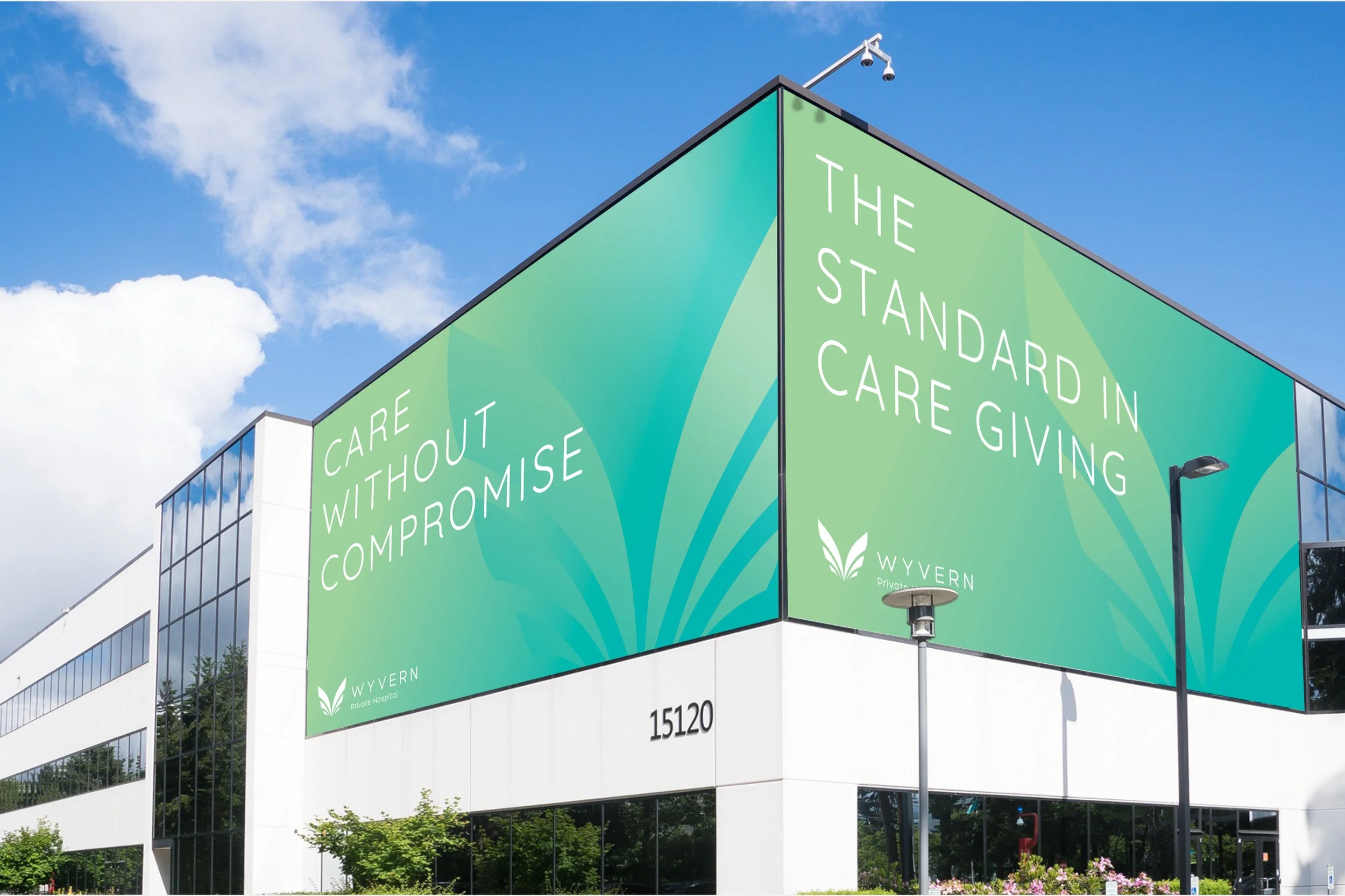
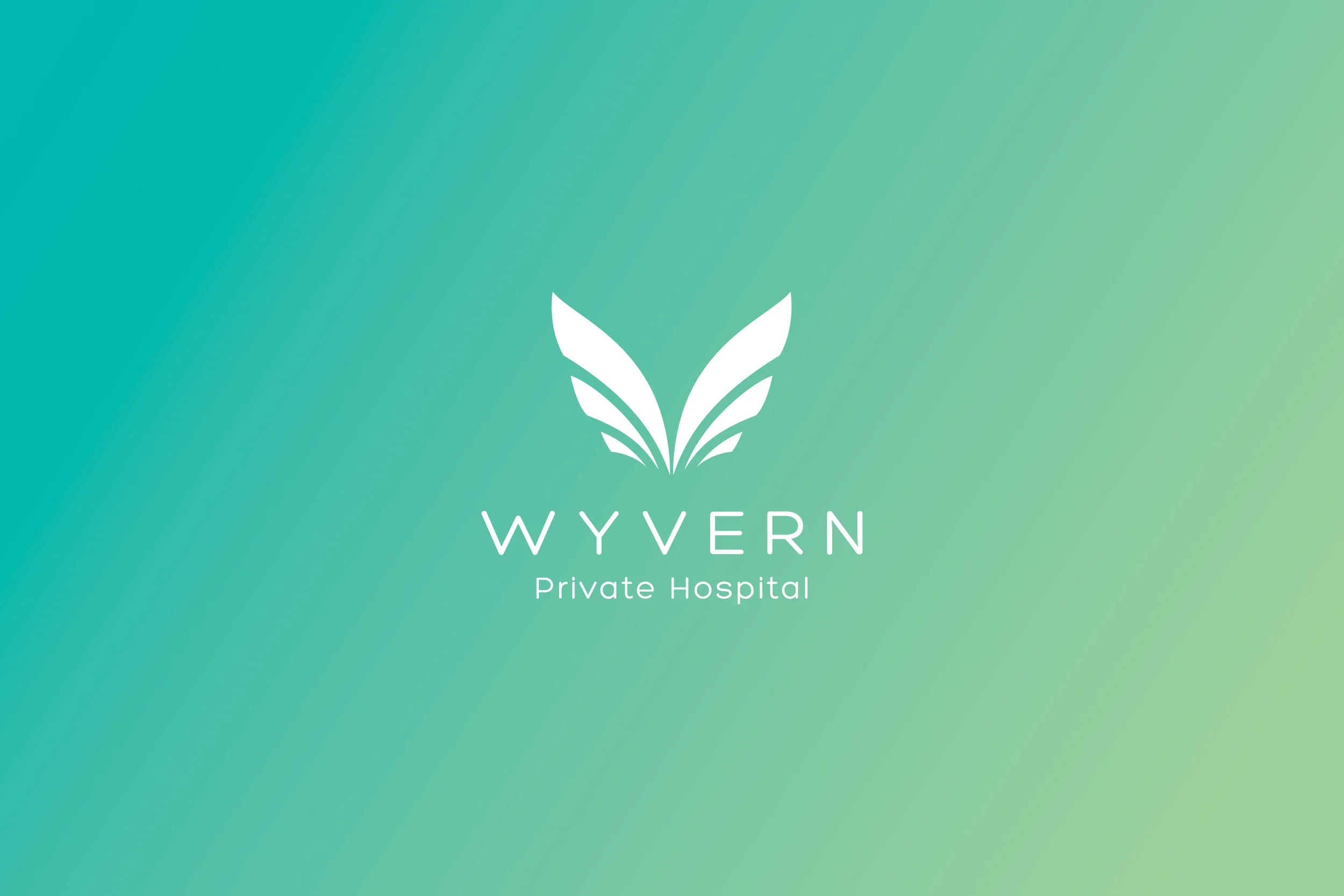
The icon takes inspiration from the ‘wings’ of a literal wyvern, while the shape also graphically hints at the shape of a “W” reinforcing the brand name.
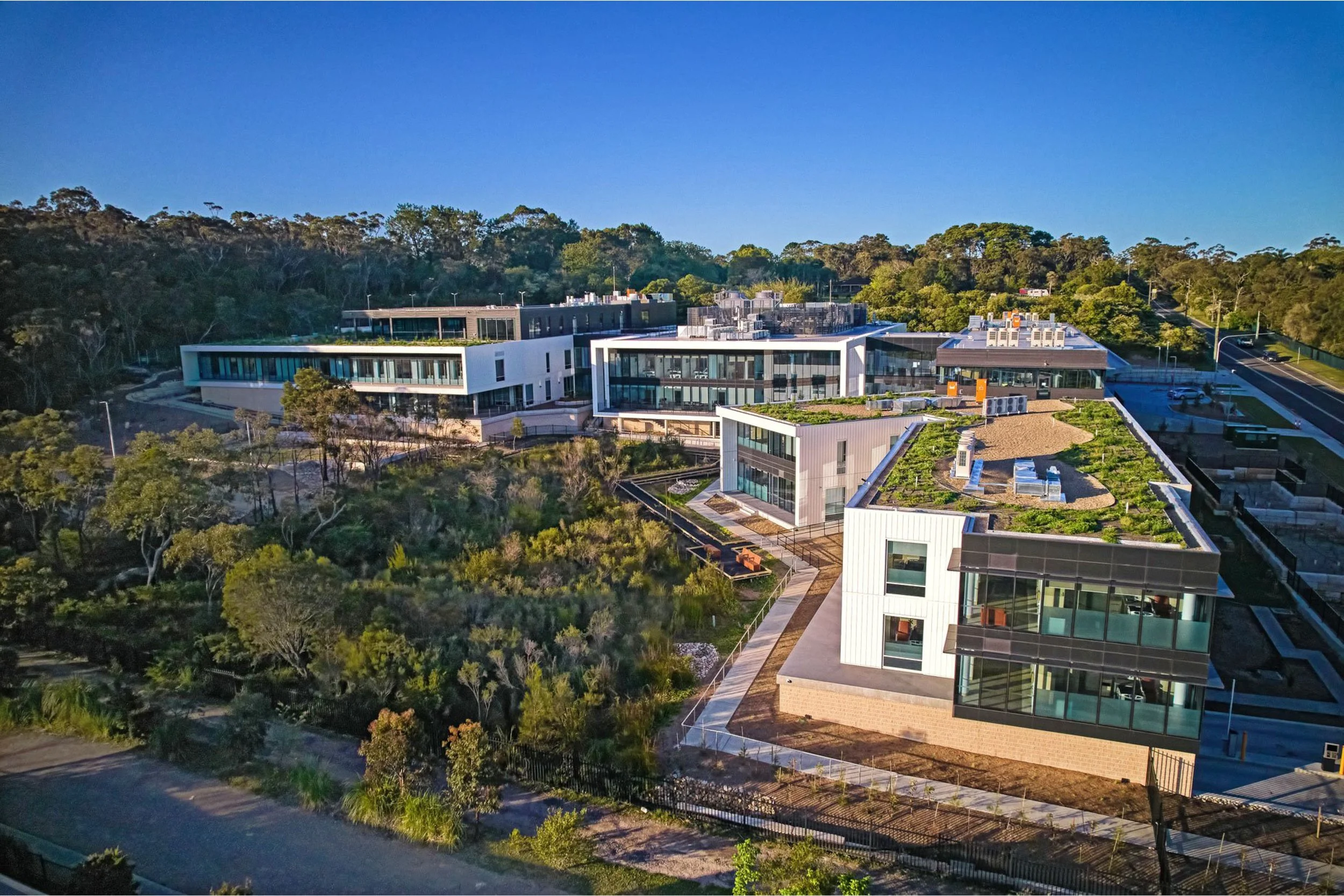
Further, the brand also has a strong connection to ‘nature’ – it’s hospital grounds are built in a beautiful garden-like area, surrounded by Australian natural fauna. Therefore the colour palette was also carefully chosen to reflect nature, tranquility and healing.
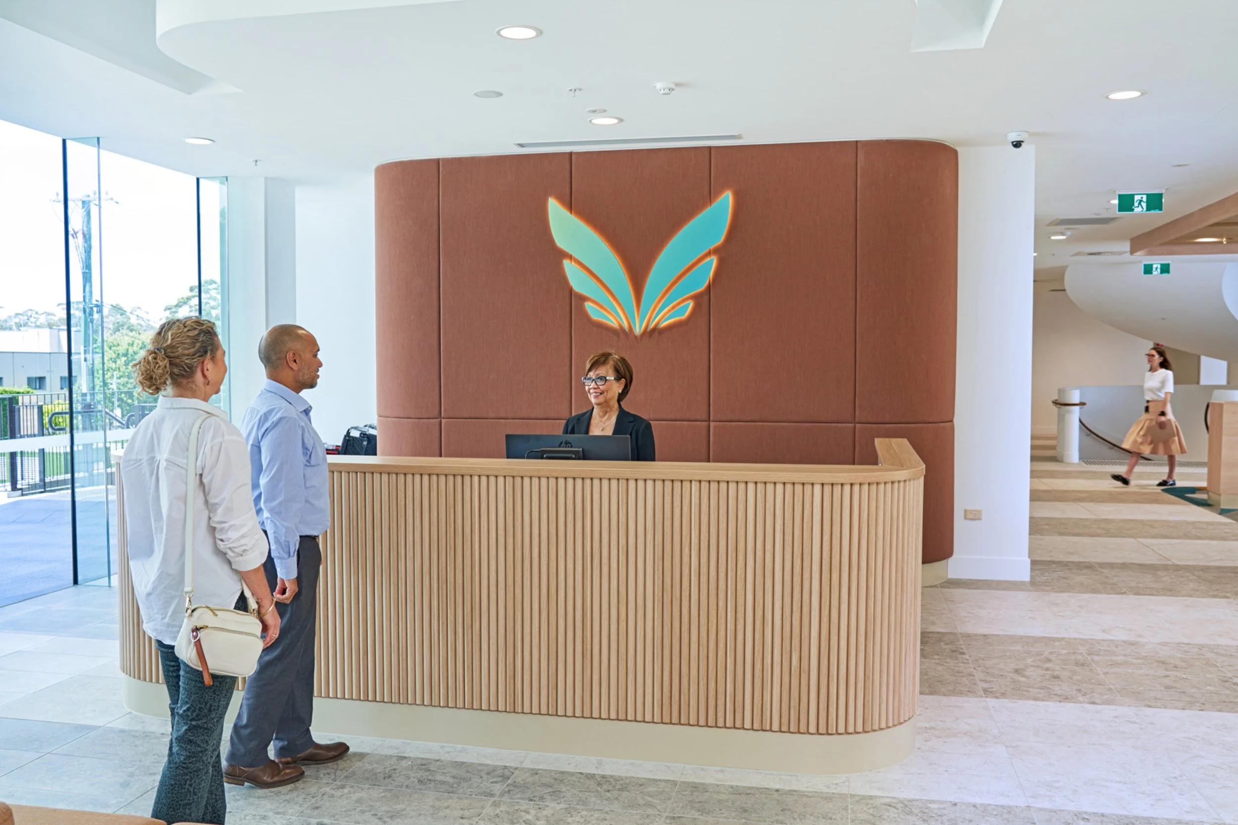
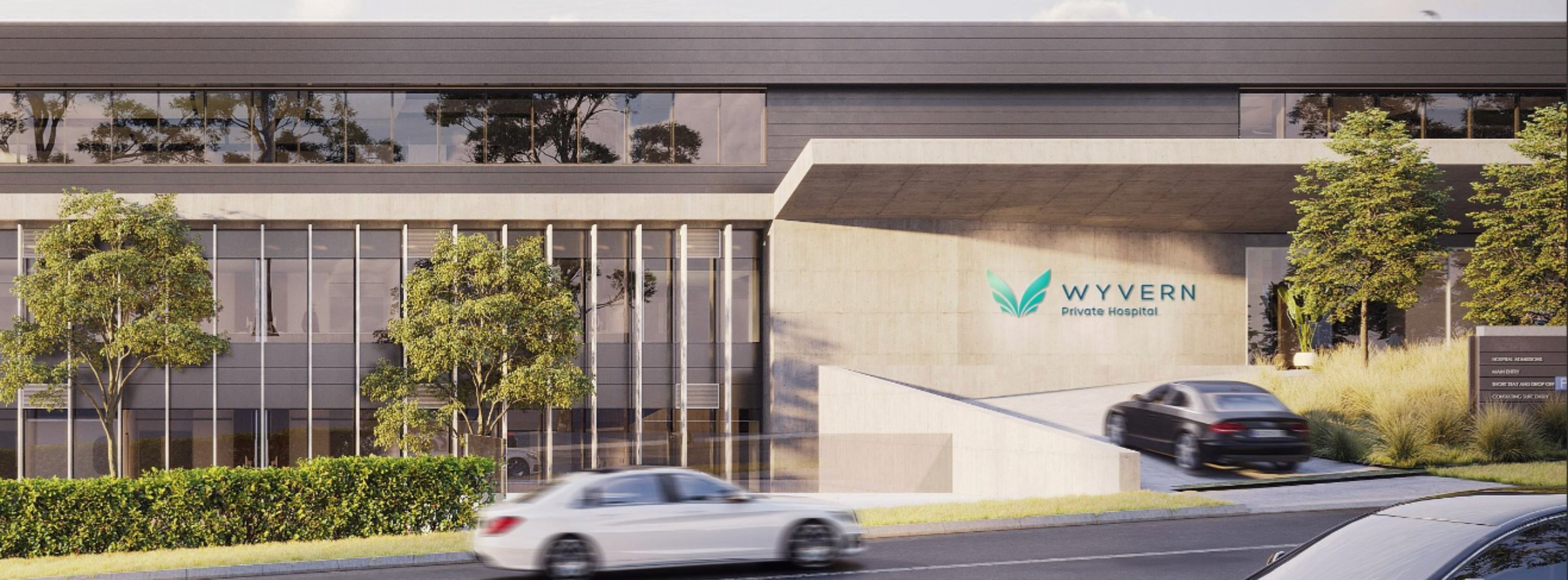
The brand identity was rolled-out into various forms of collateral including building signage, uniforms, the website, as well as all print and digital collateral.